Beyond Notebook Navigator: Why Tool Design Matters More Than Ever in the AI Era
Some say the people now tinkering with AI were once tinkering with note-taking apps. Thinking about it, that describes me perfectly.
I’m now a heavy Obsidian user. What I love most about it is first, the extremely rich plugin ecosystem, and second, the ability to embed JavaScript directly into notes, turning them into a programmable system. This kind of freedom is incredibly appealing to programmers.
Last year, a plugin suddenly became very popular: Notebook Navigator. After using it, I uninstalled all my previous plugins—including management ones, layout ones, even calendar and homepage, which I had been using all along.
This gave me an even stronger realization: what AI amplifies isn’t efficiency itself, but the “convergence ability” between tools.
In the era of AI-accelerated development, those scattered small problems can be quickly identified, merged, polished, and ultimately turned into a smoother, more complete tool experience with almost no boundaries.
This article isn’t a manual. It’s about something more fundamental: when development barriers are dramatically lowered by AI, what should tool design really focus on?
Notebook Navigator: A “Pain Point Convergence” Experiment
What Does It Actually Solve?
Notebook Navigator does something seemingly simple—it replaces Obsidian’s default file browser. It provides a two-column structure: a navigation tree on the left, file list and preview on the right, while supporting various filtering methods like tags, folders, and search, with almost all operations doable via keyboard.
These capabilities themselves aren’t particularly new—you could find them across different plugins. What makes Notebook Navigator truly special isn’t adding new features, but changing something more fundamental: it converges Obsidian’s originally fragmented information organization methods into a single interaction entry.
In Obsidian, you can use folders, or tags, or rely on search or bi-directional links. These methods aren’t unified—they exist in parallel. You have to make choices to some extent, even switching between different panels. What Notebook Navigator does is make that choice disappear.
The same note can exist in both folder structure and tag system simultaneously, without needing to switch views to understand it. This experience is essentially closer to a multi-dimensional indexed database than a traditional file system.
It replaced many of my existing plugins, like calendar and homepage. Also, I really love the flashy Rainbow-colored folders, and the ability to easily change folder icons. (Yes, I’m a folder organization enthusiast.)
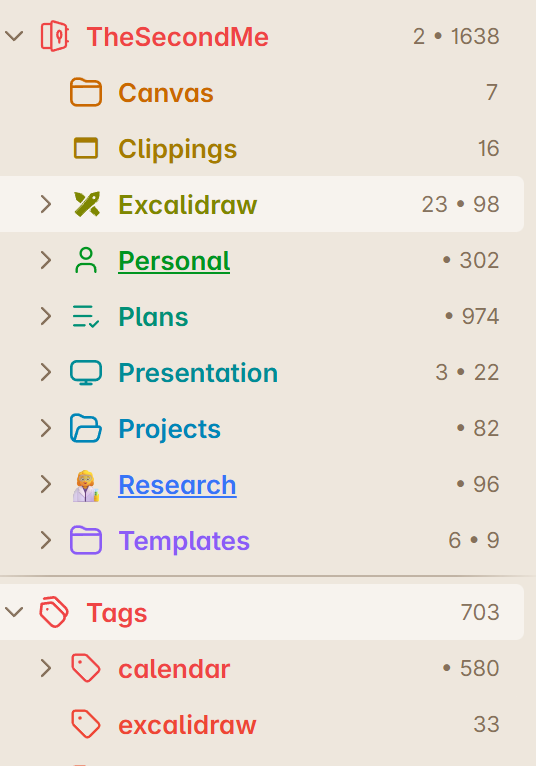
Customizable Space: Making Tools Fit Your Hand
What impressed me most about Notebook Navigator is its plasticity.
It allows you to adjust almost every key display and interaction method. You can change preview density, adjust how structure expands, define filtering rules, or rewrite your own shortcut logic. You can even create completely different view sets for different scenarios.
Behind this is a clear design philosophy: tools shouldn’t define how users use them; they should allow users to define the tool’s shape.
Good tools shouldn’t be like standard-sized shoes, but like moldable clay that can be reshaped repeatedly.
What Tool Design Should Focus on in the AI Era
What makes Notebook Navigator so impressive isn’t the plugin itself, but the trend it represents: those things that seemed like just “small problems” before—clicking one extra time, switching one extra panel, remembering one extra shortcut—they always existed. It was just that development costs were too high to justify solving them.
But things have changed. When development costs are compressed by AI, these problems are no longer ignored. They start being constantly combined and merged, ultimately forming a new experience paradigm. The core of competition has also shifted.
Writing a feature isn’t hard anymore. Making a plugin isn’t hard either. What’s truly difficult is how you organize these features together, and whether users feel any boundaries when using them.
Looking one layer deeper, user needs haven’t actually changed. What people want is finding content faster, completing operations more smoothly, organizing information more naturally. What’s really changed is user tolerance.
Before, as long as a feature existed, some clunky design was acceptable. But now, if a tool makes people switch contexts frequently or think hard, they’ll leave quickly—or even build their own alternative.
AI is making “settling” increasingly unacceptable.
In the future, the differences between tools are shrinking, while each person’s way of using them is expanding.
Author: Xiaozhao
PhD in Software Engineering · 13 years Full-Stack Development
Focus on AI workflows, software system design, and agent collaboration.
Building a professional AI perfumer startup while continuously documenting technical practices and thoughts.